
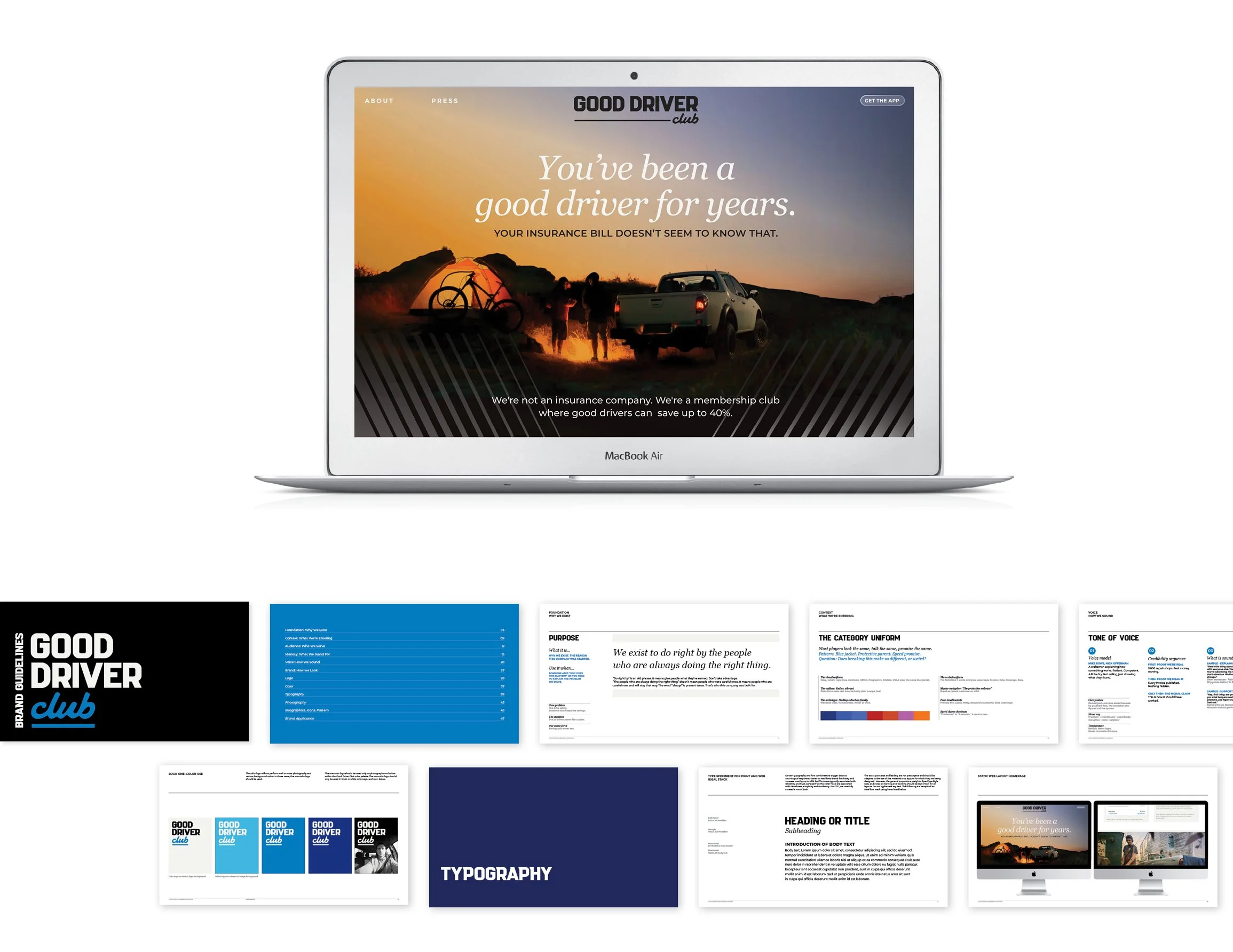


A first for North America, Good Driver Club asked us to create a brand presence for their startup. Good Driver Club is a membership-based alternative to collision and comprehensive coverage that helps good drivers keep more of their money. We developed a calm, confident palette and typographic system that balances modernity with legibility for diverse, real-world applications.
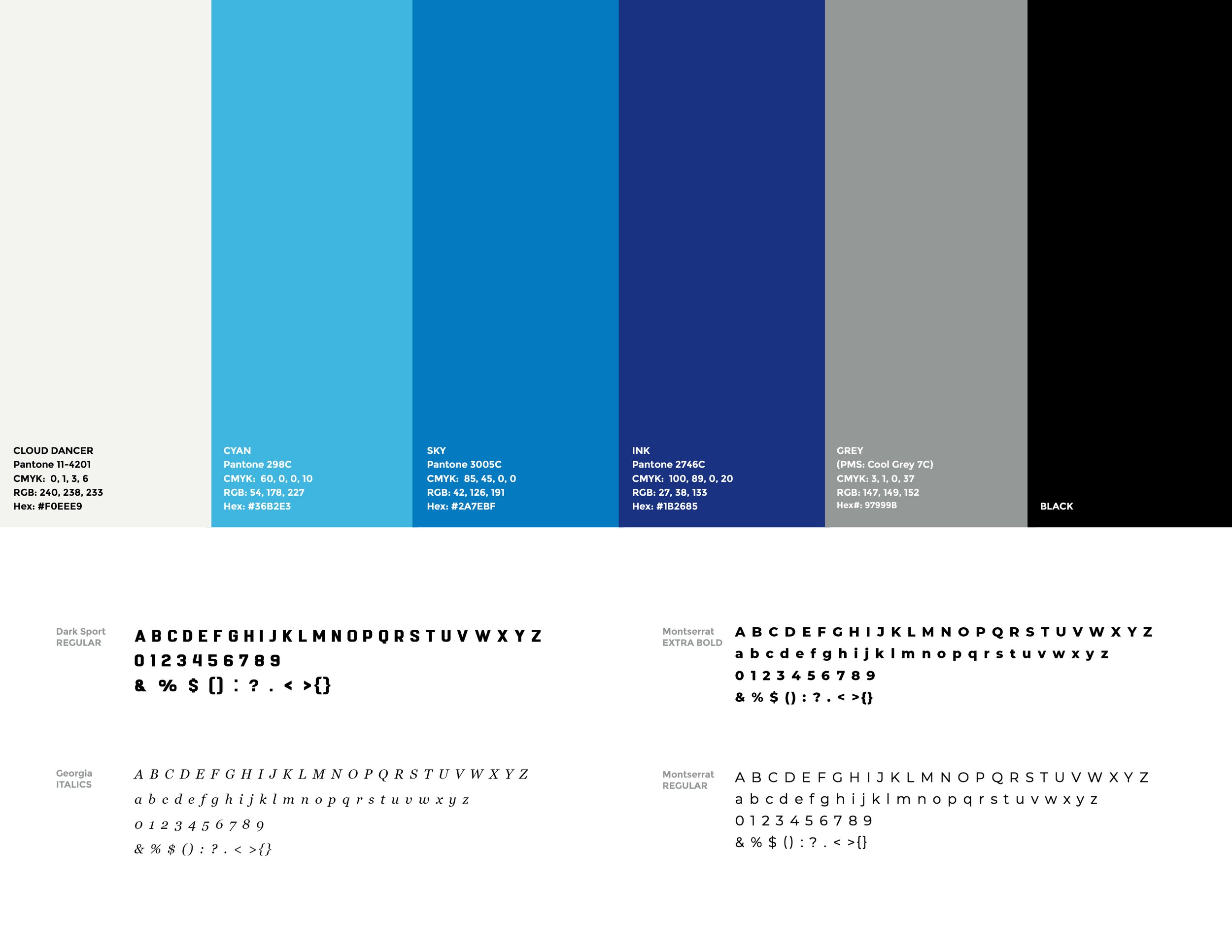
A restrained palette anchored by trustworthy blues and complementary neutral tones support clear hierarchy and accessibility across digital and print systems. Clean, highly legible type choices and a modular system for headlines, body copy and UI text ensure clarity at small sizes and in motion.
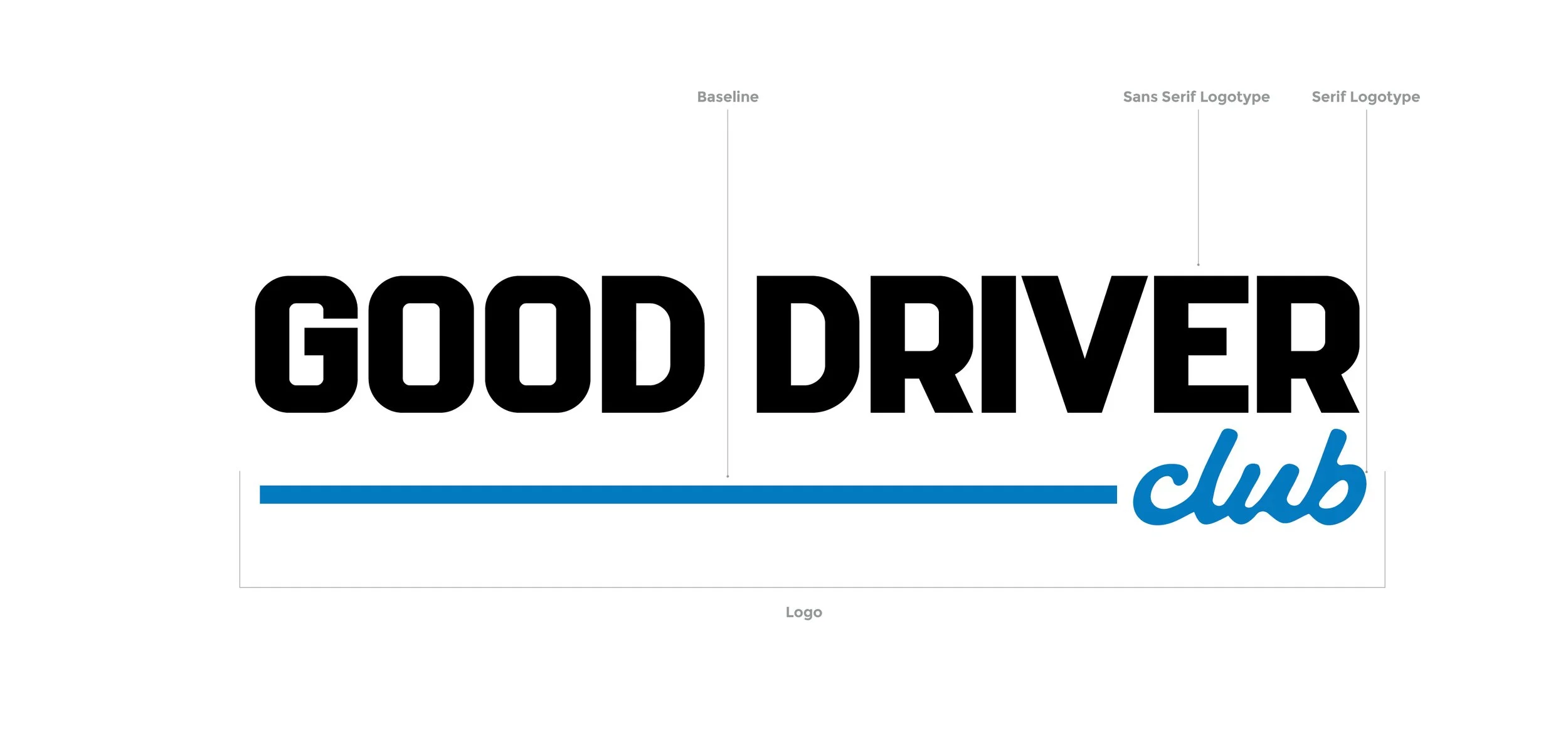
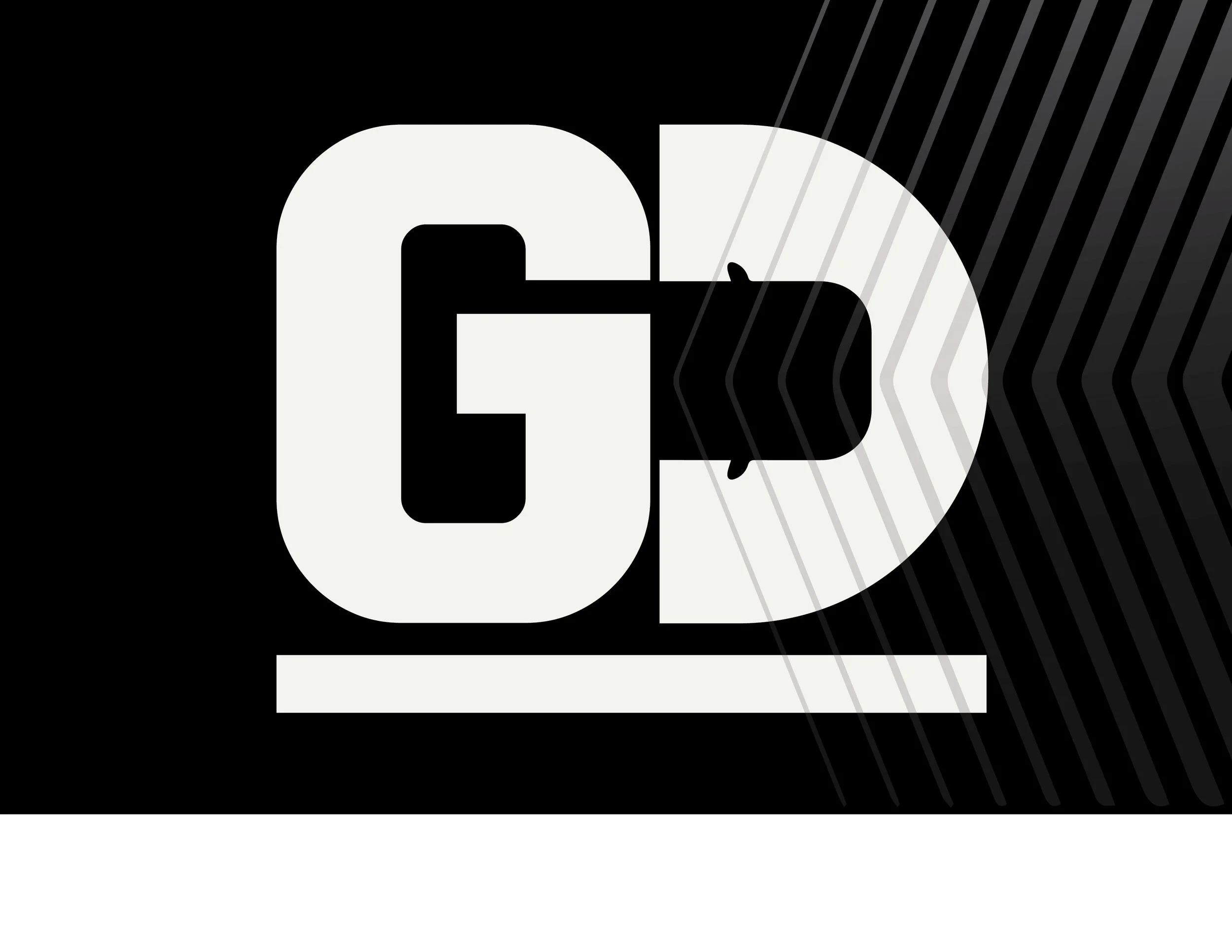
The logo uses a bold all-caps wordmark anchored by a solid base line and serif lowercase “club” to modernize and appeal to younger, “good” drivers.
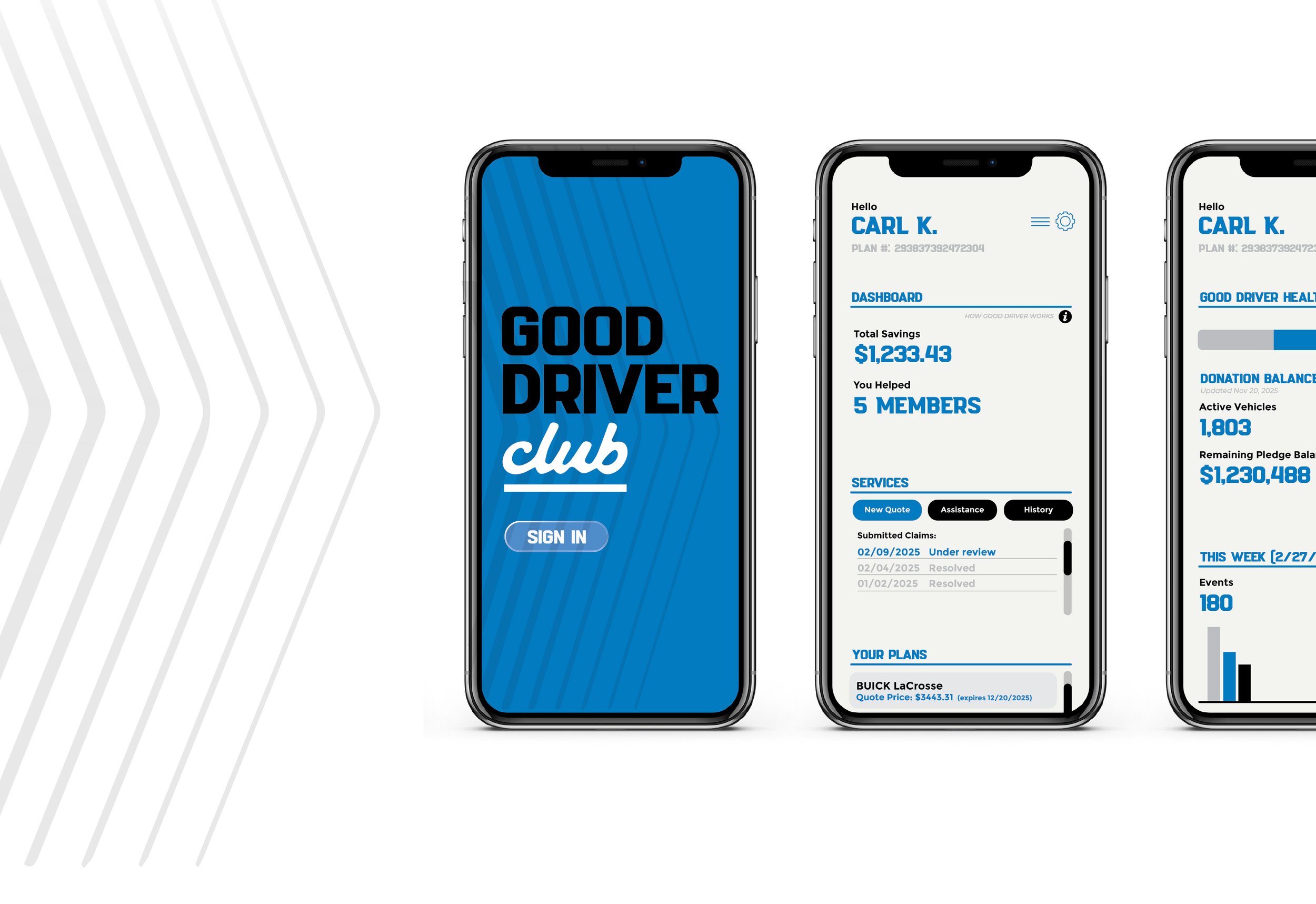
A comprehensive brand guide and early pilot materials were developed including a convenient app to keep track of savings, file claims and review monthly statements.
A family of simplified icons and a subtle pattern system derived from the mark enriched collateral while maintaining focus on messaging.
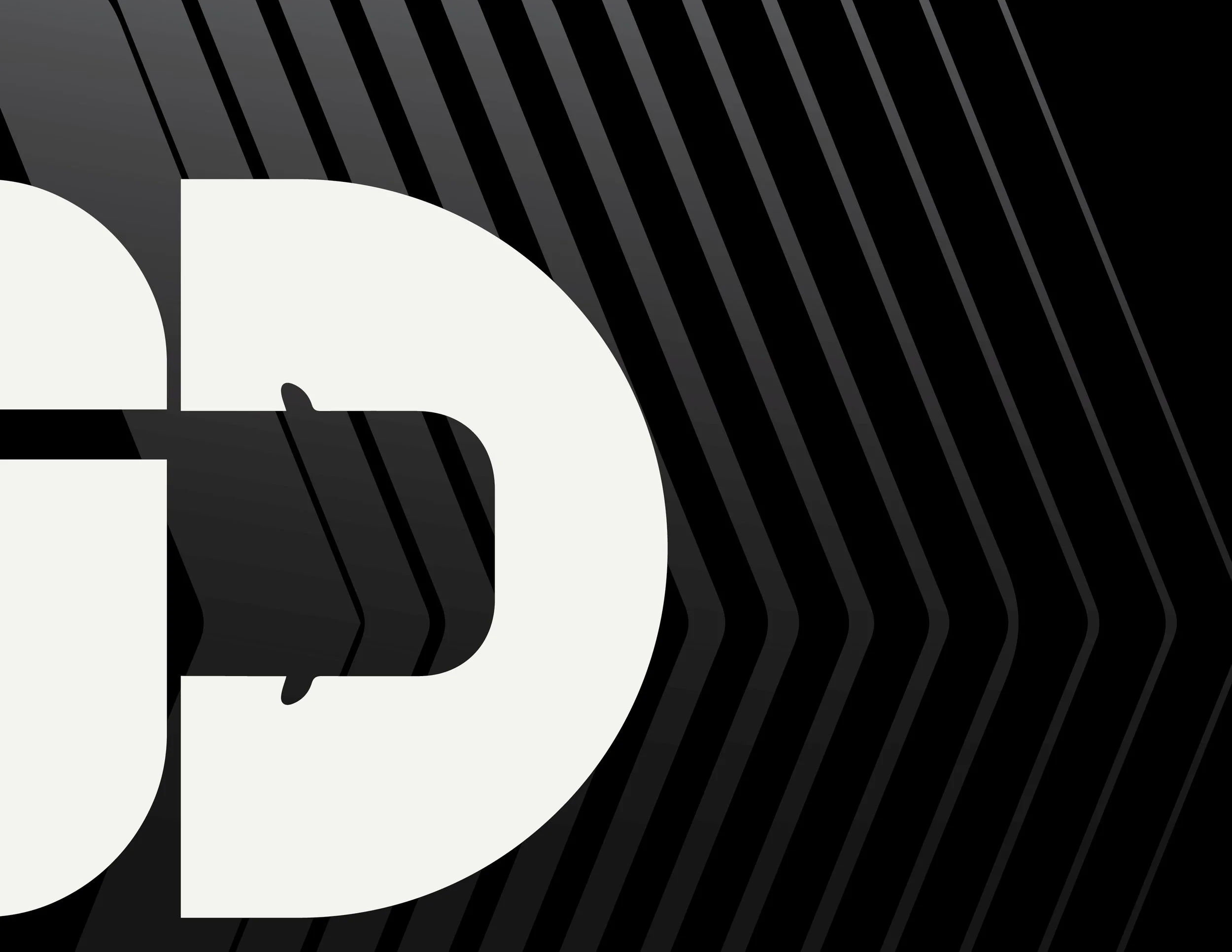
Using the “D” as both letterform and shelter creates an immediate semantic link to protection and place. The negative‑space car icon keeps the mark minimal yet clever, encouraging recognition and recall without relying on complex detail.