
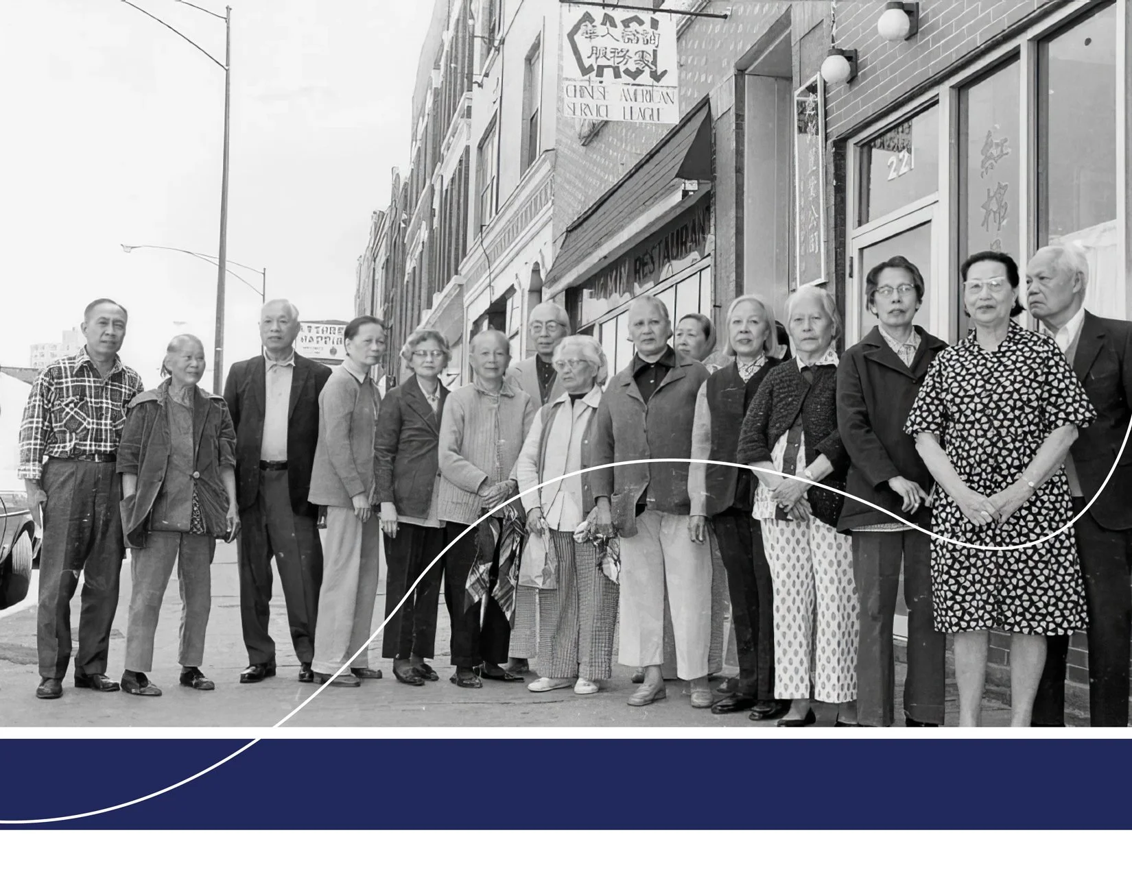

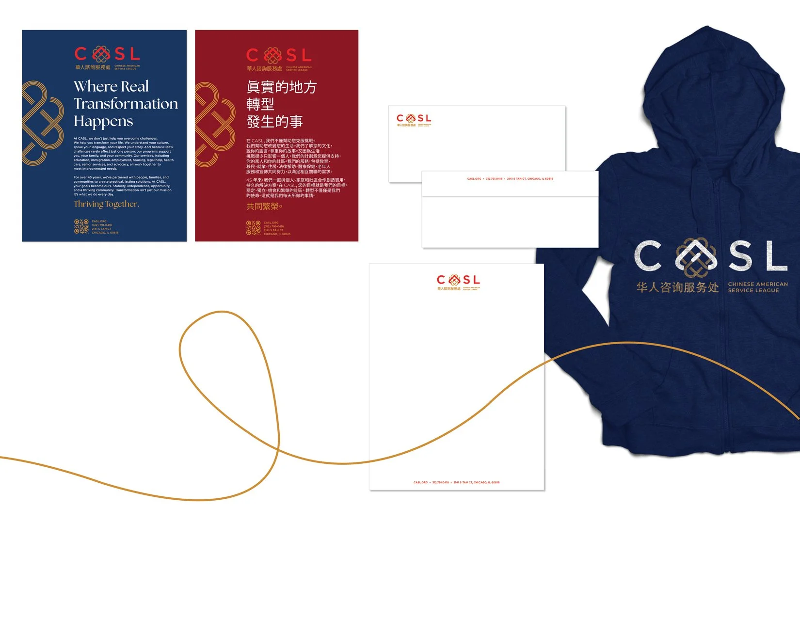


Studio J9 was selected to rebrand the Midwest’s largest Asian American social service agency. Founded in Chicago’s Chinatown in 1978, the Chinese American Service League (CASL) serves ~7,000 people annually and employs 600+. Rooted in generational wisdom, CASL advances equity for individuals, families, and communities. Known within the AAPI community, they sought to broaden public reach—a new logo honoring their origins was essential.
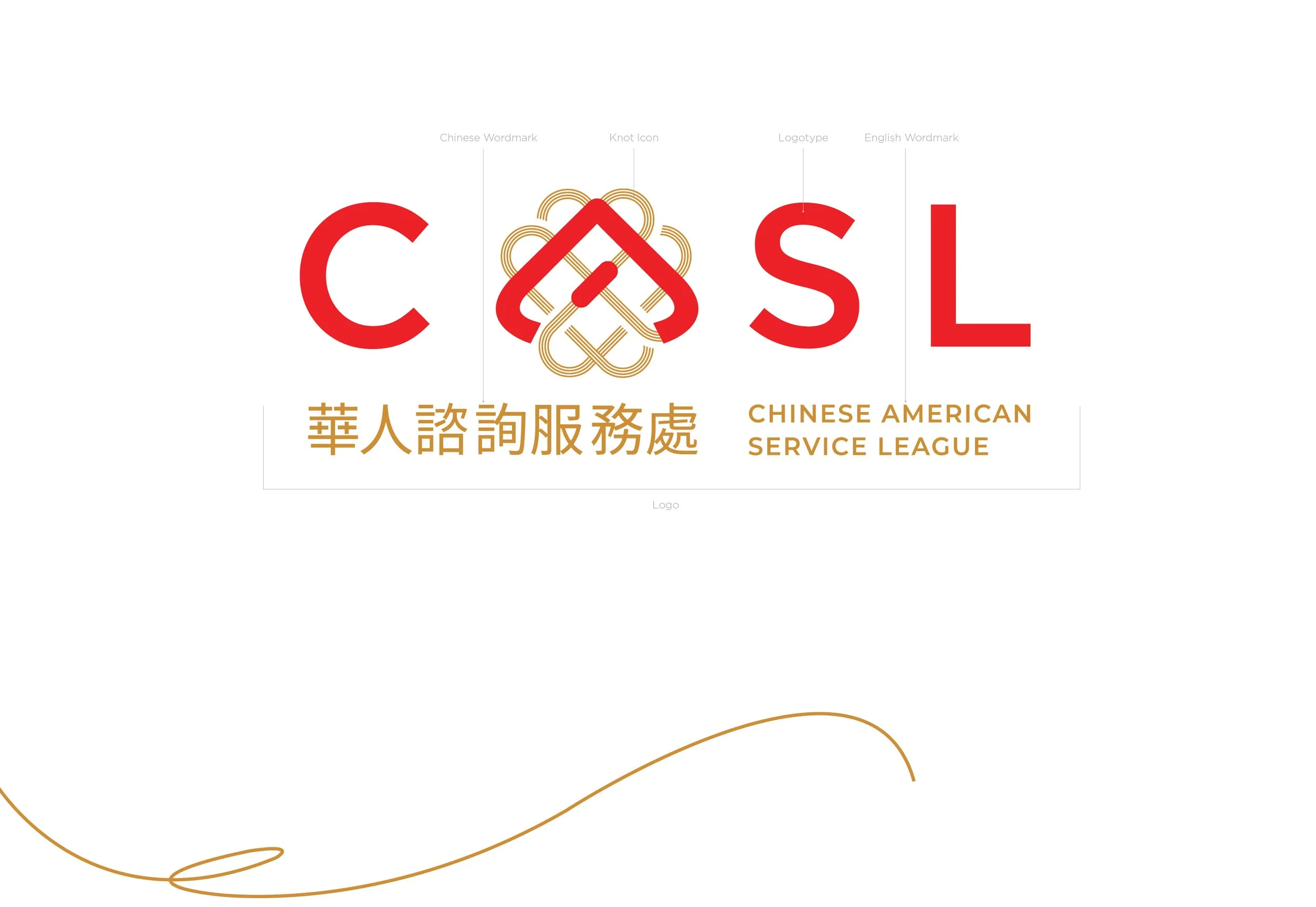
The new logo honors the community and reflects the strong connections among residents and the integrated services CASL provides. Emphasizing the idea of “weaving together” past, present, and future, the identity centers on a logomark inspired by the traditional Chinese knot—an emblem of happiness and prosperity.
Placing the knot icon at the heart of the wordmark amplifies the brand narrative. it becomes the visual anchor where form and meaning are inseparable—visually compact, conceptually resonant, and instantly identifiable.
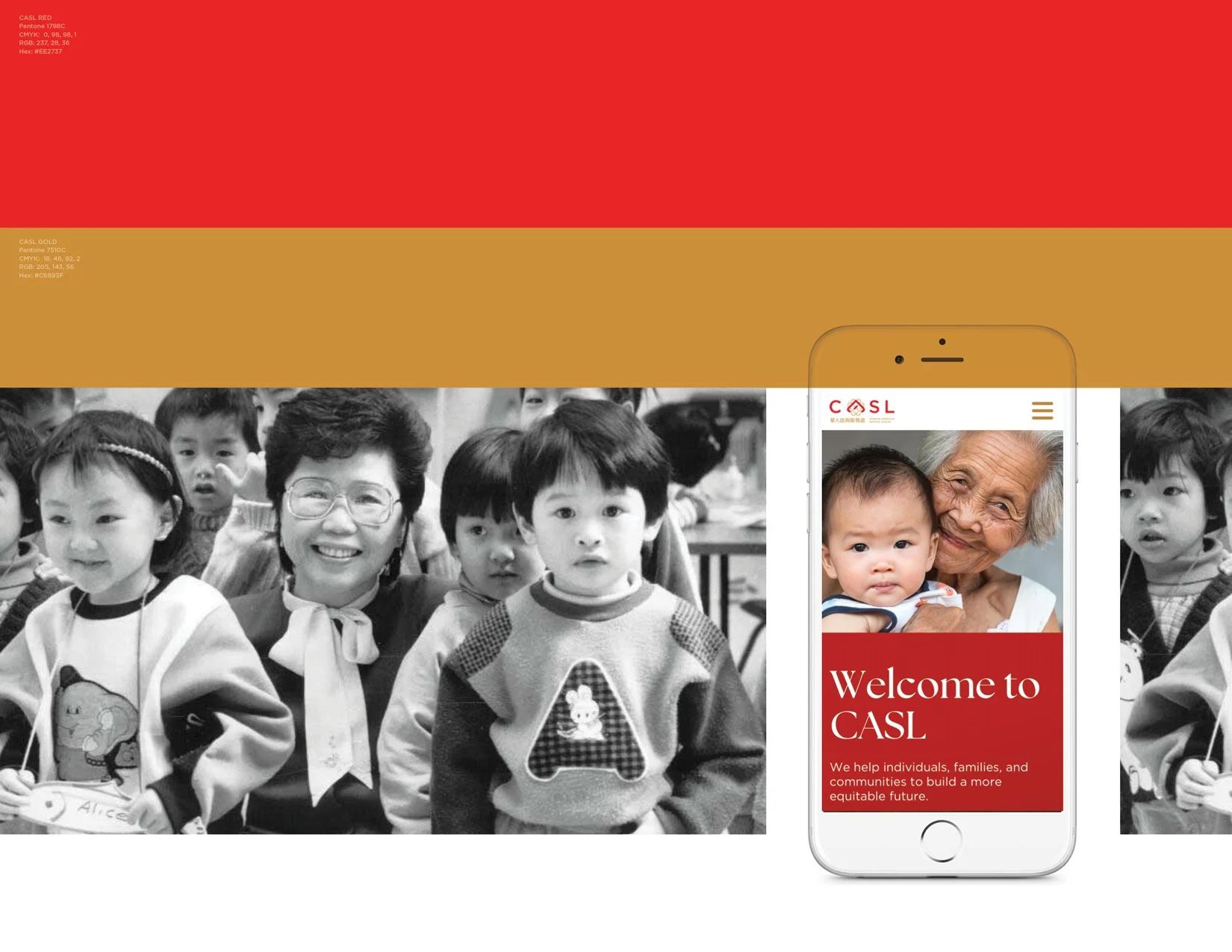
The brand’s primary palette—red and gold—was selected to convey prosperity, abundance, warmth, and positivity. Red anchors the identity with energy, confidence, and a sense of forward momentum; gold provides balance through warmth, optimism, and a premium, trustworthy quality. Together these hues form a welcoming, aspirational foundation that supports the organization’s mission and public presence.
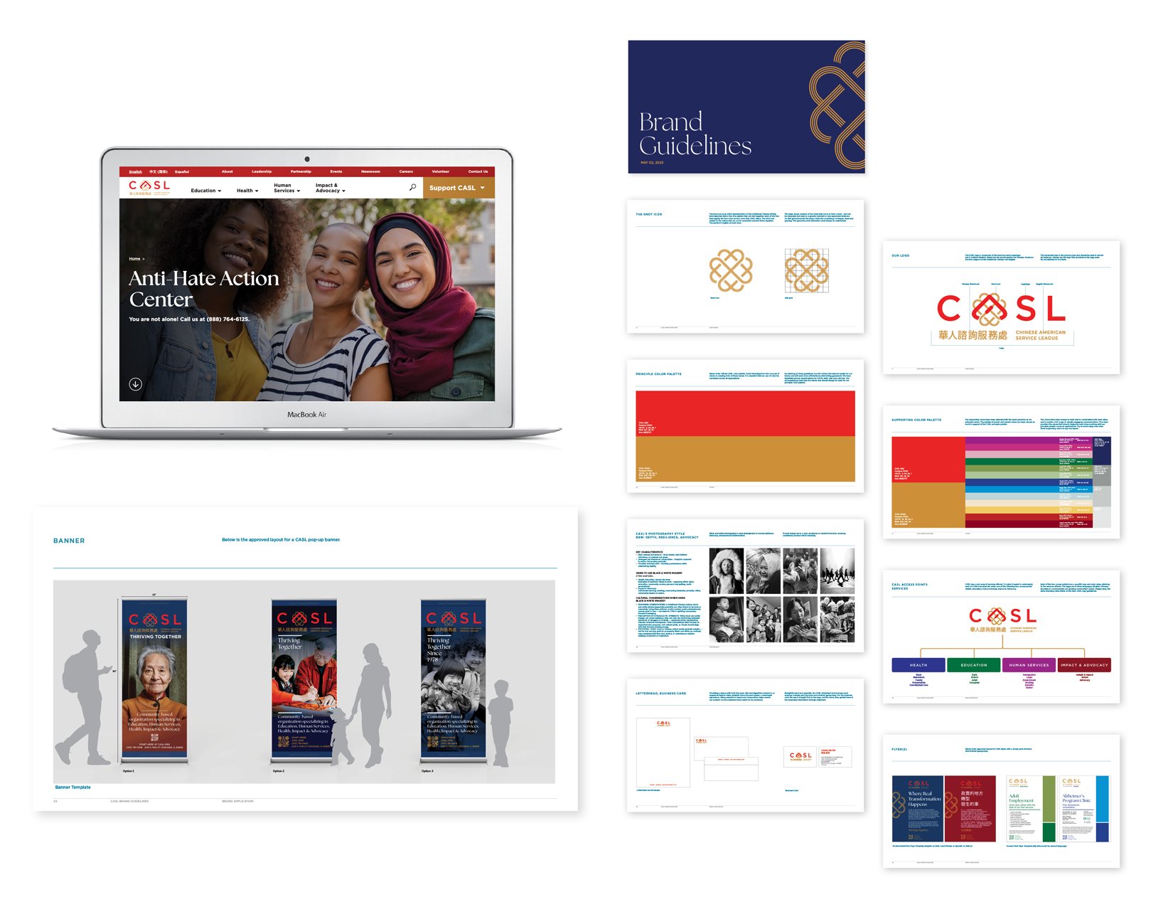
A comprehensive brand guide with clear usage guidelines was created to help the organization maintain and extend brand recognition. Along with brand purpose, mission, core values the guide dives into visual identity and covers three primary areas of application: digital items, stationery, and promotional items.